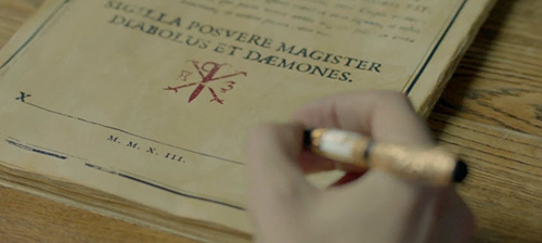
Here’s a question: What’s the best typeface to read in a 2.5-sized font? It’s a tough answer to pin down. We’ve tried serifed fonts, sans-serifs. We’ve adjusted ascenders and rounded out finials. We’ve tested everything from Abadi to Zapfino…
And while we prefer something with elaborate flourishes for the body of the contracts we draft, we want to keep the fine print as fine as possible. Simple enough to read with a microscope, but unobtrusive enough to be easily overlooked.
After all, your signature holds you responsible for all the terms of the contract, whether you’ve read them or not. It’s not our fault if you’ve focused too much on a few specific line items and not enough on all the fine print running along the border of the contract.

This post inspired by an idea from Cass S.


